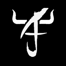
Rick and I were talking about creating an exclusive logo for AJ few weeks ago. After much brainstorming, we came out with this........
Created from AJ's initial Athan Jay Xee Liew. The two horns symbolized an ox since he was born in the year of ox, and also the nick we gave him "阿牛仔". I also like how the logo somehow looks like a chinese character "牛".


8 comments:
So creative, I think AJ will like it very much
I like the logo, very creative ;). AJ should start learning how to draw the logo first before writing abc... :P.
Whoa!! How did you guys do that???
That looks cool how you can put the name together like that.
wah i'm thinking a line of tee-shirts and clothings with this logo!!
cool design. can associate the 'niu' character. so clever.
wahsehh got logo le..
creative...
A creative one. I do see that it looks like an ox. :)
jezalmy:
I hope so.
emotionalistic:
Good idea. Need to train him as soon as he starts picking up pencil. LOL
Liwan, (( Ms. K )):
Thanks. I also don't know. I wanted something with AJ only, and was playing with the letters somehow it ended up like this. I then use Photoshop to draw it.
tuti:
Hahaha, you're 100% built with business mind! I didn't even think of that. Emm.....now I itchy itchy want to print it on t-shirt, cap, mug etc etc.
keeyit, oceanskies79:
Haha. Thanks!
Post a Comment